
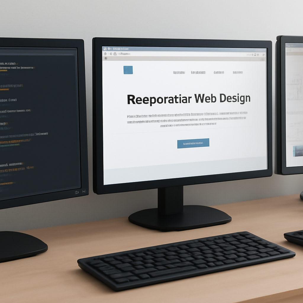
Good web development balances user experience, performance, and long-term maintainability. Whether you’re building a single-page app or a content-driven site, a few core techniques repeatedly deliver better outcomes: use semantic HTML, prioritize accessibility, optimize resource delivery, control JavaScript work, and measure real user experience.
Start with semantic markup and accessibility
Choose the right HTML elements for structure and intent rather than relying on generic containers. Semantic markup gives browsers and assistive technologies built-in cues that improve navigation, discoverability, and keyboard support. Add ARIA only when native elements can’t express the required semantics, and ensure interactive controls are reachable by keyboard and announced correctly by screen readers.
Optimize how resources load
Reduce the bytes a page must download and make critical content available first. Modern image formats can dramatically shrink file sizes compared with legacy formats; serve next-generation images with responsive sizes (srcset/picture) and specify image dimensions or placeholders to avoid layout shifts. Use native lazy loading for below-the-fold images and defer nonessential scripts so the browser can render the page earlier.
Use modern delivery and caching
Place large static assets on a CDN and configure strong caching headers so repeat visitors download less. Consider newer transport features supported by modern networks to reduce connection overhead and multiplex requests where available. Proper cache-control, immutable asset naming, and short critical-path payloads keep latency low and servers efficient.
Keep JavaScript lean and focused
Break code into modules, load only what’s required for the initial view, and apply progressive enhancement: render a usable UI with minimal scripting, then enhance with interactivity. Avoid long main-thread tasks; replace expensive synchronous work with async patterns, web workers, or incremental updates to keep the UI responsive.
Design for layout stability and responsiveness
Responsive CSS and fluid layouts are table stakes. Reserve space for images, ads, and fonts to prevent content jumps during loading. Use containment and layout techniques that limit repaint and reflow cost. Prioritize a consistent visual flow so users don’t lose context when parts of the page load or update.
Measure, iterate, and set realistic budgets
Define performance and accessibility budgets (payload size, render time, interactions, and accessibility checklist items). Use lab and field measurements to catch regressions: automated audits and real-user metrics together give a fuller picture. Track metrics that reflect loading, interactivity, and visual stability, then prioritize fixes that benefit most users.
Practical checklist to apply today
- Use semantic HTML and minimal ARIA.
- Serve responsive next-gen images and reserve layout space.
- Enable lazy loading for noncritical images and defer scripts.
- Host static assets on a CDN and set cache headers.
- Split JavaScript and avoid long main-thread tasks.
- Measure with both synthetic audits and real-user monitoring; enforce budgets.
Applied consistently, these techniques lead to faster pages, fewer accessibility issues, and easier maintenance. They also make it simpler to adopt newer platform features over time because the app starts from a predictable, well-structured baseline.

