
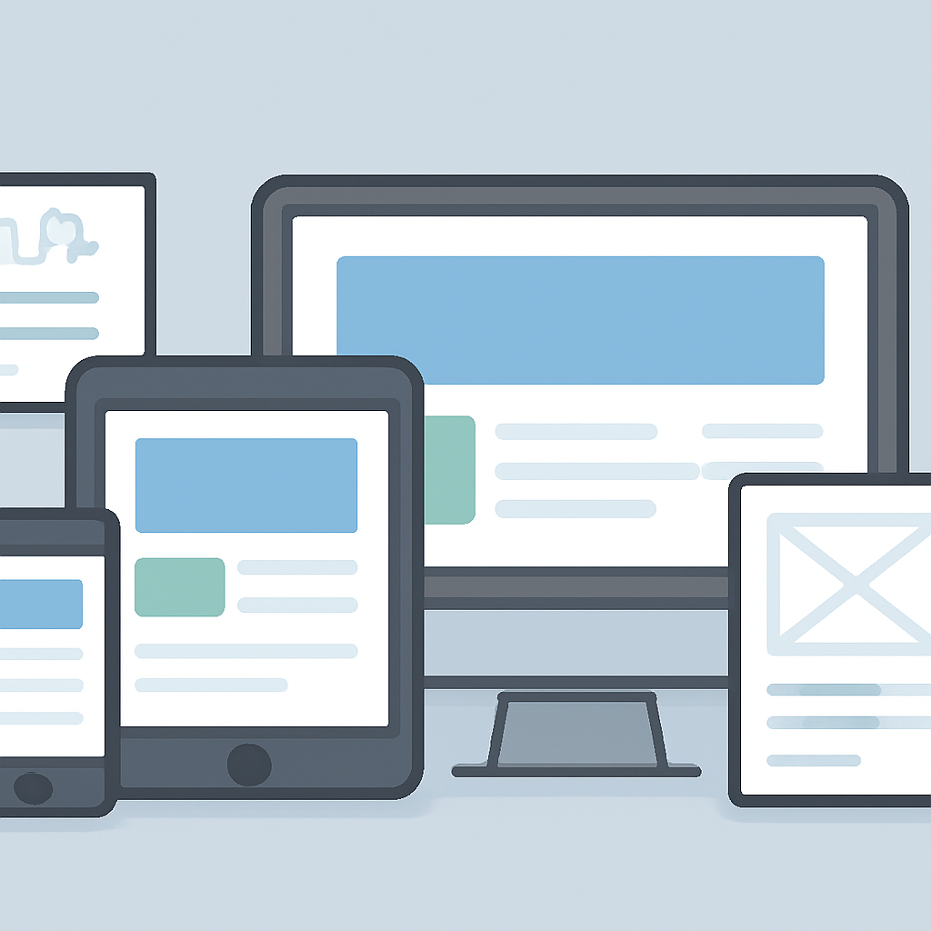
Good web design is more than visual polish: it balances layout, accessibility, and performance so people can find and use content quickly and reliably. The following techniques focus on practical choices you can apply across projects to improve usability, reduce friction, and make sites easier to maintain.
Design for every device with mobile‑first responsive layouts
Start layout and interaction work targeting small screens first, then scale up with media queries. Mobile‑first development forces priorities (content, navigation, essential actions) and tends to produce leaner CSS and fewer layout surprises. Use fluid grids, relative units (%, rem, vw), and modern layout modules so components adapt instead of relying on fixed widths.
Choose the right layout tools
- Use CSS Grid for two‑dimensional page layouts (rows and columns).
- Use Flexbox for one‑dimensional components such as toolbars, nav bars, and small content groups.
- Combine Grid and Flexbox: Grid defines the page structure; Flexbox handles alignment inside components.
Prioritize performance: perceived speed matters
Optimize what users see and interact with first. Measure and tune metrics that reflect user experience: the time until the main content appears, visual stability during load, and responsiveness to input. Reduce blocking JavaScript, load fonts and large images responsibly, and serve assets via a CDN when possible. Modern image formats (WebP, AVIF) and techniques like responsive srcsets, lazy loading, and careful compression often yield the biggest wins for page weight.
Make accessibility a foundation, not an add‑on
Use semantic HTML (headings, <nav>, <main>, lists, forms) so browsers and assistive tech can interpret structure without extra attributes. Follow accessibility guidelines for color contrast and form controls: normal text needs higher contrast against backgrounds than large display text. Prefer native HTML controls where possible and add ARIA only when semantics are missing or when building custom widgets—then follow ARIA authoring patterns and manage keyboard focus.
Build repeatable components and a design system
Create a component library (buttons, inputs, cards) with documented tokens for spacing, color, and typography. Componentization reduces visual drift, speeds development, and improves accessibility and testing consistency. Consider utility classes or a CSS-in-JS approach if it fits your stack, but document usage and accessibility rules alongside each component.
Progressive enhancement and resilient behavior
Design features to work at a basic level without JavaScript, then enhance with scripts for richer behavior. Progressive enhancement reduces catastrophic breakage for users with limited connectivity or older browsers and improves SEO and crawlability. Fallbacks for fonts, features, and media ensure content stays accessible even when a modern API is unavailable.
Test continuously and iterate
- Automate basic checks: semantic markup, color contrast, and accessibility linters.
- Run performance audits and track user‑focused metrics to prioritize fixes.
- Include users in testing—observing real interactions reveals priorities that metrics alone miss.
Adopt these techniques incrementally: focus on semantic structure, fast perceived load, and reliable interactions first. Over time, a pattern library, performance budget, and accessibility checklist will make new pages faster to build and easier for everyone to use.

