
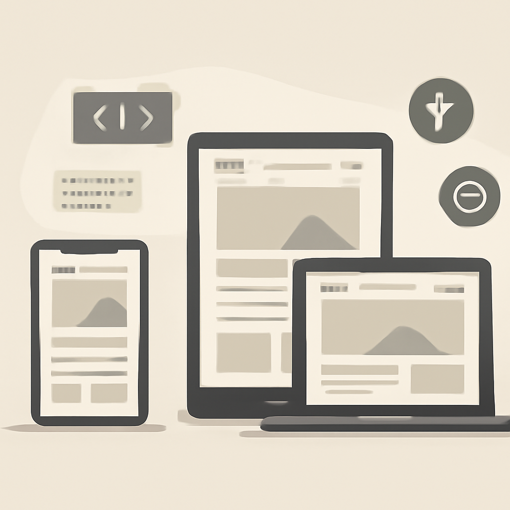
Good web design balances aesthetics with clarity, performance, and accessibility. The techniques below focus on practical choices that improve usability, reduce maintenance, and make sites more resilient across devices and network conditions.
Design for mobile first and responsive layouts
Start layouts and content priorities for small screens, then scale up. Use flexible grids, relative units, and media queries to adapt typography, spacing, and navigation. Define breakpoints around content needs (where layout breaks), not specific devices, so the design remains future-proof as devices and screen shapes change.
Use semantic HTML and structure content
Semantic elements (header, nav, main, article, section, footer, h1–h6, p, ul/ol) give every page a logical structure that browsers, assistive tech, and search engines can understand. Semantic markup reduces the need for scripted workarounds, improves keyboard navigation, and makes content easier to maintain.
Prioritize accessibility and inclusive patterns
Design choices should support people with visual, motor, cognitive, and hearing differences. Provide meaningful alt text for images, ensure keyboard focus is visible and predictable, follow color-contrast guidelines, and avoid relying solely on color or motion to convey information. Use ARIA only to supplement native semantics when necessary, not as a first resort.
Optimize performance as a design principle
Performance governs perceived quality: faster pages increase engagement. Techniques include minimizing render-blocking resources, compressing and modernizing image formats, using responsive images (srcset and sizes), deferring noncritical JavaScript, and leveraging effective caching and CDNs. Measuring and iterating with real-user metrics keeps improvements targeted.
Choose modern layout systems
Use CSS Grid for two‑dimensional layouts and Flexbox for one‑dimensional arrangements. Combined, they replace many legacy layout hacks and simplify responsive behavior. Component-based CSS (utility classes, CSS custom properties, or design tokens) helps keep styles consistent and easier to update across a site.
Prefer progressive enhancement and graceful degradation
Build a solid, accessible baseline using HTML and CSS first; layer interactivity and advanced features with JavaScript so the core content remains usable if scripts fail or a device is constrained. Progressive enhancement encourages robust experiences across a wider range of browsers and conditions.
Practical checklist
- Mobile-first breakpoints and relative units
- Semantic HTML and clear heading hierarchy
- Alt text, keyboard focus, and sufficient contrast
- Optimize images (appropriate formats & responsive sizes)
- Minimize and lazy-load noncritical assets
- Use CSS Grid and Flexbox for layout
- Measure with real-user metrics and iterate
Applying these techniques together makes sites faster, easier to use, and more inclusive. Start small—pick two areas (performance and accessibility are high-impact) and iterate; the cumulative gains compound across the user experience and maintenance costs.

