
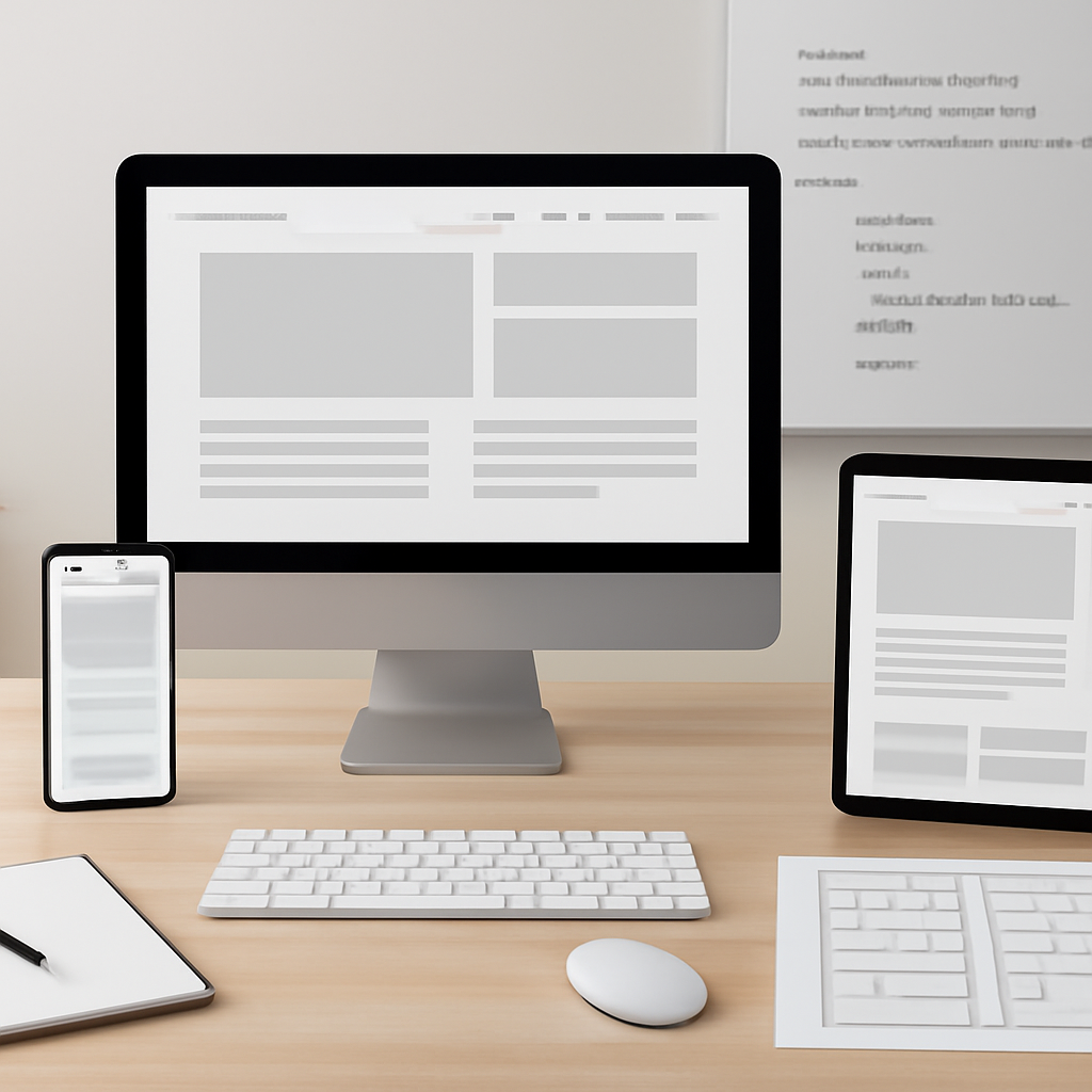
Good web design balances clarity, accessibility, and speed. Rather than chasing every visual trend, focus on a handful of repeatable techniques that improve usability for most visitors and reduce long-term maintenance cost. Below are practical, testable approaches you can use on new projects or incrementally on existing sites.
Design for screens of every size
Adopt a mobile-first mindset: start layouts for small viewports, then expand with flexible grids and media queries. Use modern CSS layout tools (Flexbox and Grid) so components naturally reflow instead of relying on fixed widths. Ensure the document includes a responsive viewport meta tag so mobile browsers scale content correctly.
Prefer semantic HTML and progressive enhancement
Structure content with appropriate semantic elements (headings, lists, forms, landmarks) so assistive technologies, search engines, and future browsers can understand your content without extra scripting. Build core functionality in plain HTML first and layer on CSS and JavaScript to enhance the experience—this reduces breakage for users on slow networks or older devices.
Make accessibility a design constraint
Design and code to the core accessibility principles: perceivable, operable, understandable, and robust. That means sufficient color contrast, keyboard focus order, descriptive link text and form labels, and ARIA only when native semantics aren’t available. Treat accessibility checks as part of QA, not an afterthought.
Optimize loading and responsiveness
Measure and prioritize what users actually experience: speed of the main content, visual stability, and interaction responsiveness. Deliver critical CSS inline for above-the-fold content, defer nonessential JavaScript, and split bundles so the browser can render sooner. Use real-user metrics and lab tools during development to find bottlenecks.
Use smarter image and media strategies
- Serve appropriately sized images with responsive srcset/sizes so devices download only what they need.
- Prefer modern compressed formats (WebP or AVIF where supported) to reduce bytes without compromising quality.
- Lazy-load off-screen images and media so initial rendering isn’t blocked by resources the user won’t immediately see.
Keep fonts and visual assets efficient
Limit the number of web font families and weights. Use font-display strategies to avoid long invisible-text periods. Subset fonts when possible and prefer variable fonts for multiple weights with a single file.
Prevent layout shifts and jitter
Reserve space for images, embeds, and ads with explicit width/height or aspect-ratio rules to avoid cumulative layout shifts. Avoid inserting content above existing content after load unless the user triggered it.
Test, measure, iterate
Combine automated tools and manual testing: run performance audits, check accessibility with screen readers and keyboard-only navigation, and gather field metrics from actual users. Prioritize fixes that deliver the biggest usability improvements per hour of work.
Applying these techniques consistently produces sites that feel faster, are easier to use, and reach more people. Start with a small set of changes—responsive layout, semantic markup, image optimization—and measure the difference; then iterate toward broader improvements.

