
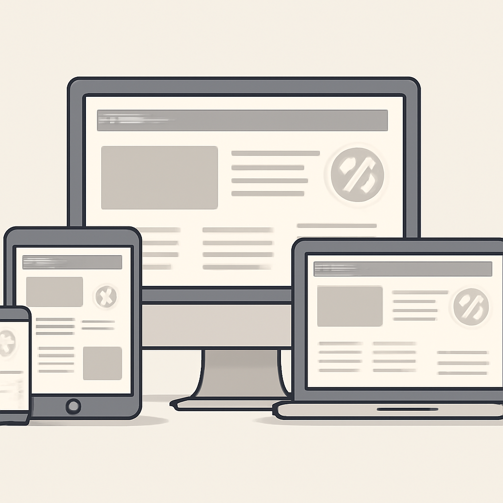
Good web design balances look, speed, and usability. The techniques below focus on practical approaches you can apply to most sites — from simple landing pages to complex web apps — so visitors get a fast, reliable, and inclusive experience.
1. Design mobile‑first and responsive
Start layouts and interactions from the smallest screens and scale up. Use flexible grids, fluid images, and media queries to adapt content across viewports. Mobile‑first thinking forces you to prioritize content and interaction, reducing bloat and improving perceived speed on slower connections.
2. Use modern layout systems
CSS Grid and Flexbox solve different layout problems: Grid for two‑dimensional, page‑level placement; Flexbox for one‑dimensional alignment inside components. Prefer semantic HTML containers and let CSS handle layout — that keeps markup accessible and easier to maintain.
3. Put performance first
Reducing load time and improving interactivity are central to modern UX. Prioritize critical content so the main visual elements render quickly, defer or asynchronously load nonessential JavaScript, and minimize blocking CSS. Use image techniques like responsive images (srcset/sizes), modern formats, and server‑side compression to cut bytes.
4. Optimize images and media
- Serve appropriately sized images using srcset/sizes so devices download only what they need.
- Offer modern formats with fallbacks: many projects use AVIF or WebP for better compression and then fall back to older formats when needed.
- Lazy‑load offscreen images and media so initial page loads fetch fewer resources.
5. Make accessibility nonnegotiable
Good accessibility benefits everyone. Write semantic HTML, include meaningful alt text, ensure keyboard focus order, and provide sufficient color contrast. Treat accessibility checks as part of development and QA — automated scanners catch many issues, but human testing (including with assistive tech) is essential.
6. Build with components and a design system
Reusable components and design tokens reduce duplication, speed development, and keep visual language consistent across pages and teams. A documented system helps designers and engineers make aligned decisions and ship predictable, testable UI faster.
7. Favor progressive enhancement
Start with baseline functionality that works without JavaScript and layer enhancements for capable browsers. This approach improves reliability, helps SEO, and simplifies accessibility testing. For richer offline experiences, consider progressive web app features like service workers carefully and only where they add clear value.
Quick checklist
- Mobile‑first layouts and responsive breakpoints.
- Use CSS Grid/Flexbox appropriately; avoid layout tables.
- Measure Core Web Vitals and prioritize LCP/INP/CLS improvements.
- Serve responsive, modern image formats with fallbacks; lazy‑load offscreen assets.
- Follow accessibility success criteria and test with real users and tools.
- Adopt a component library or design system for scale.
Applying these techniques together — not as isolated fixes — creates sites that feel faster, work for more people, and scale with your product. Start by measuring (real user metrics and basic accessibility checks), then iterate: small wins compound into markedly better user experiences.

