
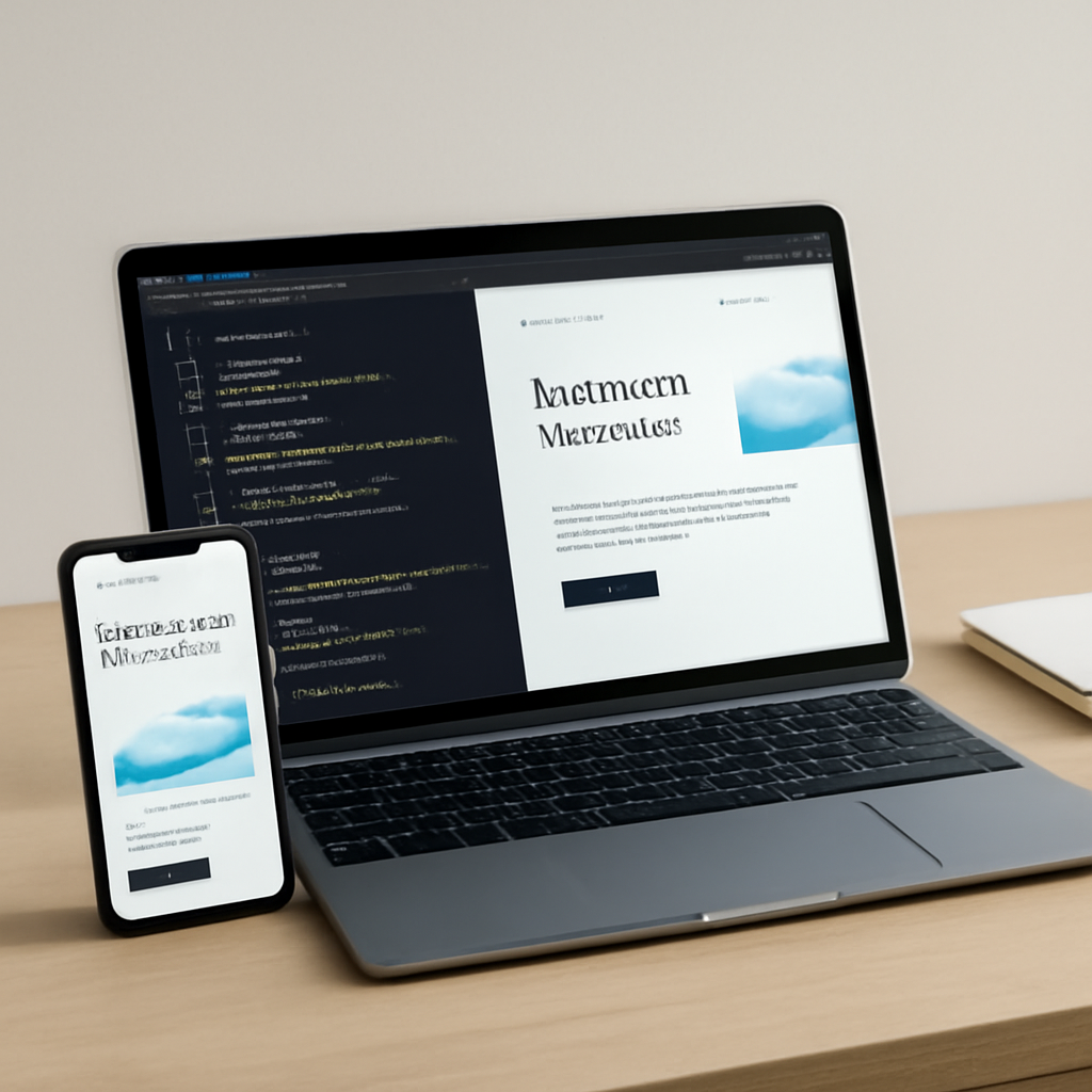
Good web development balances structure, performance, accessibility, and maintainability. This guide walks through practical techniques you can apply at the component and architecture levels to deliver faster, more resilient websites without sacrificing developer ergonomics.
1. Design components, not pages
Treat UI pieces as independent components that adapt to the space they occupy. Instead of writing layout rules that only target the viewport, use component-scoped responsive rules so a card, widget, or module styles itself based on its container. That approach makes components reusable across breakpoints, reduces CSS complexity, and simplifies collaboration between designers and engineers.
2. Progressive enhancement and semantic structure
Start with meaningful HTML structure: headings, lists, buttons, forms and landmarks. Build interactivity on top of that baseline so content remains usable when JavaScript is limited or delayed. Semantic markup improves accessibility, search indexing, and makes automated testing more reliable.
3. Performance as architecture
Treat performance as a first-class design constraint. Key tactics include serving optimized images (modern compressed formats with sensible fallbacks), setting strong caching and cache-control policies, and using a geographically distributed edge or CDN to shorten network paths. Where appropriate, prefer server-side or edge rendering for initial HTML to reduce perceived load time, and then hydrate interactive behavior progressively.
4. Measure responsiveness with modern metrics
Use user-centric metrics that reflect real interactions rather than synthetic timings alone. Track metrics that capture page responsiveness across sessions and devices, and use Real User Monitoring (RUM) to find slow interactions in the wild. Focus remediation on the operations that block the main thread or cause long task execution.
5. Prioritize accessibility and reduced motion
Accessibility is not optional. Make controls keyboard-focusable, provide clear labels, manage focus order, and avoid layout shifts that surprise users. Respect user preferences for reduced motion and color schemes by honoring system-level preferences. Design with high-contrast color combinations and readable type scales.
6. Secure-by-default practices
Serve all pages over encrypted transport, deploy tight content security policies to limit injection risks, validate and escape user input on the server side, and treat third-party scripts as potential attack surface: load them asynchronously when possible and audit their behaviors.
7. Tooling and automation
Integrate automated audits into CI: run static analysis, performance checks, accessibility scans, and unit/visual tests. Use performance tooling to profile long tasks and network waterfalls; combine lab tools with field data to prioritize fixes that matter for real users.
8. Practical checklist
- Use semantic HTML and ARIA only where needed.
- Adopt component-first responsive rules for modular layouts.
- Serve modern image formats with robust fallbacks and set width/height to prevent layout shift.
- Enable caching and a CDN, and prefer edge rendering for fast first paint.
- Measure interactivity using user-centric responsiveness metrics and act on RUM data.
- Enforce HTTPS, CSP, and server-side validation.
- Automate performance and accessibility checks in CI pipelines.
Apply these techniques iteratively: measure, prioritize the largest win for the least effort, and repeat. Small architectural choices—component-scoped responsiveness, early rendering of meaningful content, and conservative use of third-party scripts—compound into big improvements in speed, usability, and developer confidence.

