
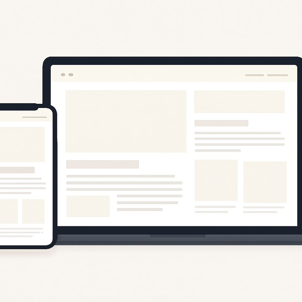
Good web design balances clarity, speed, and inclusivity. Focus on content-first layouts, predictable navigation, and performance-minded assets so users can accomplish tasks quickly on any device.
Design responsively with a mobile-first mindset
Start layouts from the smallest screens and scale up using media queries and flexible units rather than trying to shrink a desktop design. Mobile-first CSS encourages simpler markup and fewer overrides, which reduces complexity and avoids layout surprises across devices.
Prioritize accessibility from the start
Design decisions should follow established accessibility guidance: use semantic HTML, ensure sufficient color contrast, provide meaningful alt text for images, and make interactive elements keyboard-accessible. Accessibility benefits everyone (including people using assistive tech and those on slow or limited devices) and reduces rework later.
Optimize for real-world performance
Measure performance with field-focused metrics and design toward them: reduce render-blocking resources, serve critical CSS inline if needed, and minimize main-thread work. Core Web Vitals provide practical signals to target—largest contentful paint, interaction responsiveness, and visual stability—so optimize images, fonts, and JavaScript accordingly.
Serve images and media efficiently
Use responsive image techniques and modern formats for smaller file sizes. Deliver appropriately sized images (srcset or picture) and prefer next-gen encodings where supported to lower bandwidth and improve load times. Compression and choosing the right format for the content type (photographs vs. icons) materially affect page speed.
Progressive enhancement and lazy loading
Build a functional baseline in plain HTML/CSS, then layer on JavaScript features for capable browsers so the site stays usable if advanced features are unavailable. Defer noncritical assets and lazy-load offscreen images and iframes to speed initial rendering and conserve user data. Native lazy-loading attributes offer a simple way to defer media without extra scripts.
Choose layout tools intentionally
Use CSS Grid for two-dimensional page layouts and Flexbox for one-dimensional components; both are modern, well-supported layout models that reduce reliance on complex hacks. Combine them with logical, semantic HTML and a lightweight utility layer for spacing and alignment to keep styles predictable and maintainable.
Quick checklist to apply today
- Design mobile-first and test breakpoints on real devices.
- Run an accessibility audit and fix semantic and contrast issues.
- Measure Core Web Vitals and reduce largest images or blocking scripts.
- Serve responsive images and prefer next-gen formats where possible.
- Lazy-load offscreen media and progressively enhance features.
Applying these techniques together—responsive structure, accessibility-first choices, performance tuning, efficient assets, and modern layout systems—produces sites that are faster to build, easier to maintain, and friendlier for every visitor.

